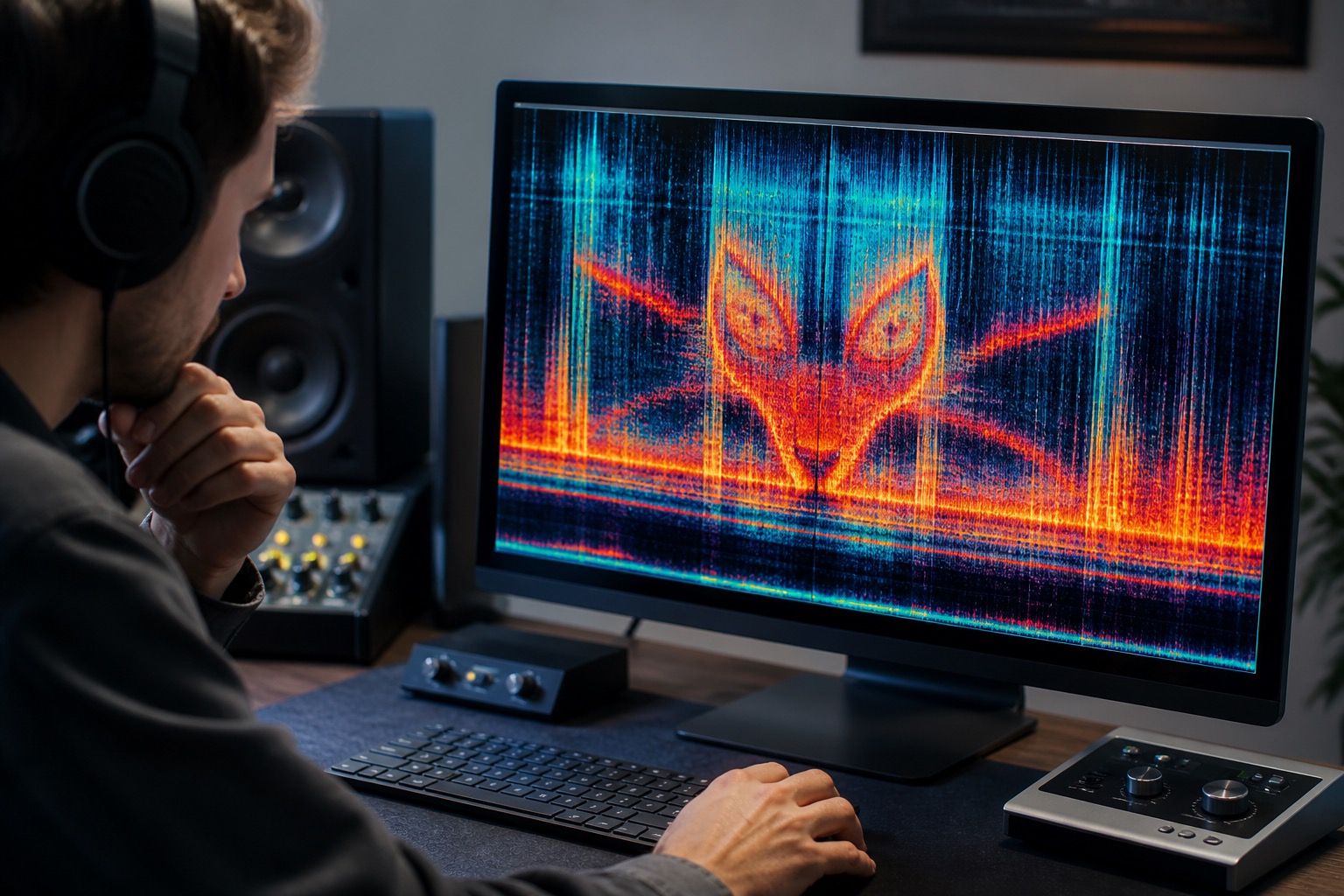
An image to audio spectrogram tool can feel almost magical the first time it works: a picture becomes a noisy sound, then the same picture appears again when the sound is viewed as a spectrogram. It is a clever audio trick, but it is easy to confuse that trick with useful music analysis. For cleanup, mastering, and release checks, the difference matters.
Why people turn images into spectrogram audio
Most people try an image to audio spectrogram converter online for one of three reasons. They want to hide a message in sound, make a visual joke for a track, or understand how frequency and time are connected. All three are valid experiments. None of them automatically produce a better mix.
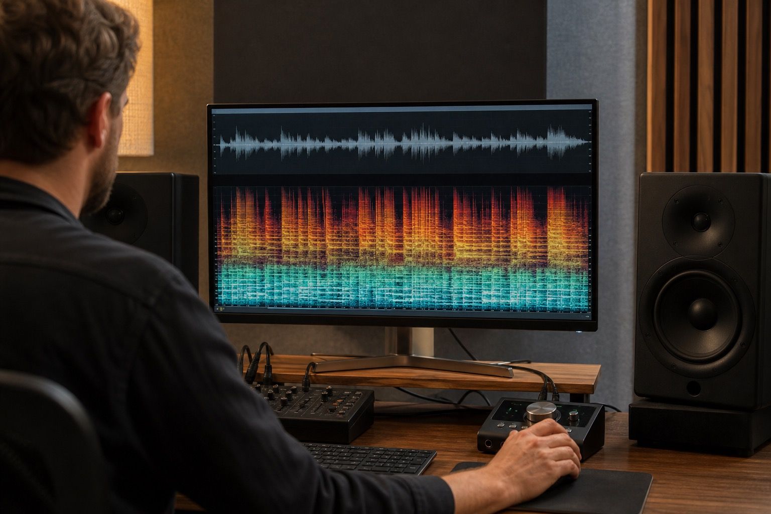
A spectrogram is a picture of sound over time. Low frequencies sit near the bottom, high frequencies sit higher, and brightness usually represents energy. When a tool works in the other direction, it treats the uploaded image as a target pattern and renders tones that will draw that pattern when analyzed again. A white line across the top becomes a high sustained tone. A dark empty area becomes silence or near silence. A face, logo, or symbol becomes a stack of narrow tones that often sound sharp, synthetic, and detached from the music.
The appeal is obvious. It gives audio a visible secret. In a short intro, a transition, or an experimental noise bed, that can be fun. The problem starts when the result is treated as a normal musical layer. The generated sound is built to satisfy the eye first. The ear is only along for the ride.
What the generated sound usually contains
An image to spectrogram generator does not understand melody, groove, vocal tone, room sound, or mastering balance. It usually creates many sine-like partials, narrow bands, sweeps, and abrupt level changes. Those ingredients can redraw a shape clearly, but they also create tonal noise that sits awkwardly on top of a track.
If the image has hard edges, the audio often has clicks or sudden spectral jumps. If the image has fine texture, the sound may become brittle. If the image has large bright blocks, the rendered tone can dominate one frequency area for too long. A clean visible shape is often the opposite of a clean listening experience.
| Image choice | Likely sound | Risk in music |
|---|---|---|
| Simple white line or symbol | Clear narrow tone or sweep | Can ring above vocals or cymbals |
| Detailed photo | Dense noisy texture | Masks transients and makes fatigue worse |
| High contrast text-like shape | Sharp onsets and repeated bands | May create obvious artifacts after export |
| Soft gradient | Broad filtered wash | Can blur the mix without adding musical detail |
The table is the boring truth behind the party trick. The more readable the shape, the more the sound tends to announce itself as an artificial layer. That can be a deliberate texture, but it should be chosen with the same caution as distortion, bitcrushing, or harsh saturation.
Where the trick can damage musical quality
The first weak point is masking. A hidden image audio layer may sit in the same upper-mid band as a vocal, snare snap, or bright synth. On small speakers it may become a thin whistle. On headphones it may turn into a narrow pressure point that makes the track tiring after thirty seconds.
The second weak point is export behavior. Lossy formats do not care that your spectrogram shape is supposed to be pretty. MP3 or AAC encoding can smear the edges, remove quiet details, and add watery artifacts around dense high-frequency areas. The image may become less readable, while the sound becomes more annoying. That is a bad trade.
The third weak point is false confidence. A track can show an interesting visual pattern and still have bad balance, clipped peaks, dull transients, or a harsh chorus. Spectrogram art is not a mastering meter. It is not a repair pass. It does not prove that a Suno or AI-generated track is clean.
When I test this kind of layer, I keep it muted until the main track already works. Then I bring it in at a very low level, listen through cheap earbuds, laptop speakers, and a quiet room, and remove it if I start noticing the trick more than the song. The visual idea has to earn its place by sound, not by screenshot.
How it differs from checking a real track
Using an image to spectrogram online tool starts with a picture and asks audio to recreate it. Checking a real track starts with audio and asks the picture to reveal problems. Those are opposite workflows. Mixing them up leads to strange decisions.
In a real quality check, the spectrogram helps you spot things that are hard to describe by ear: a constant high-frequency whistle, a sudden block of broadband noise, a clipped-looking wall during the hook, or a gap where a stem drops out. The visual clue sends you back to listening. You do not fix the track because a shape looks uneven; you investigate because the image points to a possible sound problem.
With spectrogram art, the image is the goal. With music analysis, the image is evidence. That distinction is especially useful with AI music cleanup. A generated song may contain chirps, metallic tails, breathy smears, or fake room noise. A spectrogram can help locate them, but the final decision still comes from listening in context.
If a converter produces a beautiful hidden image but the rendered tone fights the chorus, the chorus wins. If a quality check shows an ugly but harmless blob that nobody hears, the track may not need surgery. Spectrograms are helpful when they support judgment. They become a distraction when they replace it.
When to keep it as an experiment only
Keep image-to-audio work in the experiment box when the sound is mostly a novelty, when the readable shape matters more than the musical part, or when the layer only survives at a volume where it irritates the listener. There is no shame in that. Some tricks are best kept as process notes, hidden bonus material, or a short production exercise.
For a release, I would be stricter. Render the idea as a separate stem. Leave headroom in the main mix. Test the combined track before and after limiting. Check whether the shape survives the final export, but also check whether the final export still feels good after repeated listening. A spectrogram screenshot is not the audience. The listener is.
The safest use is educational. Upload a simple image, render the audio, view it again, and notice how time, frequency, and brightness relate. Then open a real song and look for the same building blocks: bass energy near the bottom, cymbal wash near the top, vocal movement through the middle, and odd artifacts that do not behave like instruments. That lesson is far more useful than forcing a logo into a mix.
An image to audio spectrogram converter can be a smart creative toy. It can also teach you how spectral displays think. Just do not let the trick pretend to be a cleanup method. If the goal is better AI music, use the spectrogram to find problems, use your ears to judge them, and keep visual gimmicks out of the mastering chain unless they genuinely improve the track.